

Who's up for some serious design talk? When you see that header, you'll know it's coming. Haha. I've always hesitated to blog about this area of my life because I thought it quite hard to explain architecture in a less astute, more relatable, and entertaining manner that will interest a lot of people as much as fashion does. But hey, this is after all a design and fashion blog that's an extension of me. So deal with it. :)) Here goes!
*************
They say that when you get your architect's license, your first few clients will be your relatives, and your relatives' relatives. I had an early taste of this during my internship days when our family friend (my godmother) commissioned me to remodel their home. It was a two- storey residence in a subdivision in Punta Princessa, Cebu. Further details to be kept private in keeping with client- architect confidentiality.
It was my first actual design project. During my apprenticeship days, Buddy and I used to work as a full-time intern in an architectural firm on weekdays and made outsourced drawings/ small design works for other architects on weekends. But this, was my first personal design undertaking. It was scary and intimidating at first, but with God's grace I pulled it off with a some help from Bud and of course the support and openness of my trusting clients. :)
The first phase of the project was completed while I was doing reviews for ALE. Yep, this post has been sitting in my drafts more than a year. Haha.
There are a lot of challenges when rennovating a house. There's:
1. Existing structural frame (Beams, Columns)
2. Existing Utility Lines (Water lines, Electrical lines)
3. It was going to be inhabited while construction is ongoing so proper planning and temporary "relocation" should be considered (e.g. where they temporarily cook, where they temporarily watch TV, access, how to keep the house safe and enclosed even whilst demolishing a few walls, etc)
Aside from these, the client wanted to:
1. Create a more contemporary look for their old house
2. Make it more spacious
3. Add an additional bedroom at the ground floor to prepare for old age and mobility issues.
4. Do something about the extreme heat and humidity inside the home esp in the afternoons.
5. Incorporate more natural light into the home to minimize the use of artificial lighting during the
day. It had a lot of dark pocket spaces.
6. Convert the husband's office/ shop into a kitchen.
7. Move the water tank
8. Correct the use of perimeter fence as firewall.
And then of course, as in almost all projects.. honest, inevitable design issues like:
1. Budget Constraints
2. Clients' Preference VS Designer's Preference. This is real.
Let me give you a quick tour! :)
1.) PORCH.
The house had a huge porch, almost equal to the size of their living room. We divided this porch into half by moving the walls and entrance door forward, and used the second half as a transition foyer to add more space to the interiors instead. We recycled some of their old glass blocks and placed these overhead, chose a more modern and solid door for an opening statement, then placed wall lamps to give the entrance an instant makeover and give it more character. This especially looks charming at night.
The house had a huge porch, almost equal to the size of their living room. We divided this porch into half by moving the walls and entrance door forward, and used the second half as a transition foyer to add more space to the interiors instead. We recycled some of their old glass blocks and placed these overhead, chose a more modern and solid door for an opening statement, then placed wall lamps to give the entrance an instant makeover and give it more character. This especially looks charming at night.

2.) FOYER.
Instead of completely demolishing the original wall (see upper left photo), we only demolished the upper half of it, preserved the structural column, and topped it with a console table with a wooden top to serve as a element of transition and visual obsruction from foyer to living room. It will divide the space but by not completely blocking the view, we allow visual continuity to make the space feel bigger. We also added a spotlight for the artwork they will soon mount on the consul table.


3.) KITCHEN AND DINING
At the right side of the original porch was Mr. E's shop/ office (he's a practicing electrical engineer by profession). We converted the space into a kitchen and dining area. Again, to maximize space we moved the walls forward, retained the jailousie window and grills and added a little plant box with topiary plants to make the exterior more welcoming. Plants are my best friends! See the old zoccalo (low wall, like a seat) at the rightmost of the porch? 1/3 of it becomes a full wall for the porch, 2/3 will then belong to the new foyer-- to which we added a glass as a not so solid divider from foyer to kitchen. (See graphics below)
The family's old kitchen was a long and narrow space around 1meter by 6meters wide at the very back portion of the house resting against the perimeter wall was so there was hardly any light, just the little skylights on the roof. (you'll see this later) We made sure that in this new layout, the 3-part-kitchen triangle was complete. Cook--Wash--Store. And that there would be some sun shining through.

We made new cabinet shelves using plywood and MDF cabinet doors, and added some cove lighting under them, and used granite tiles instead of slab to save on cost. ;)


That's the glass partition I was talking about.

This is the new kitchen and dining, Mr E's old office/ shop. We demolished the wall dividing his office from the living room and made it fully open to make their interior space bigger, and boy did it work wonders. We didn't want any obstruction so the only thing we used to subtly divide the living from the dining was elevation. ;) We raised the living room by one step. Behind the dining, there were existing jalousie windows, we merely lowered the windows to make it longger--inviting more and more day light. We also utilized the same windows for the front of the kitchen.

The soon-to-be replaced dining table. Can't wait to see how the new dining table and mats we spotted will look on their new dining area. :) Thats Mr and Mrs E with Buddy.

4.) LIVING ROOM
Everyone knows that if this was a play, the living room is the main character. It's also one of the most fun to "direct. :) We didn't move the mirror because mirrors are expensive and this one's a huge. So what we did was cover parts of it with plywood and veneer and placed another console table infront of it so they have a space to place jars and other accents. We used a semi-glossy neutral cream-off white color consistent with the whole house to aid the mirror make the space look bigger and reflect light. Dark brown accents and monochromatic hues add drama to the space whilst keeping it clean. For small spaces, its impt to keep furniture to a bare minimum (no fuss couch, table, 2 stools) and keep an organized and clean look through out.


Pillowcases always add a cheap but interesting touch to a living room. They're super easy to play with!
Behind the couch is a big bare wall which we wall with a floral board backdrop. we took this down and made it a clean finish. We'll mount a painting here as soon as the owners find the perfect one. We're relying on this artwork to bring accent colors to the house (Thinking shades of blue reminiscent of the shades of the sea, a little dull green, and some yellow) which we'll later use a basis for additional pillow-cases and other accents for consistency.


5.) BEDROOM
We moved the masters bedroom downstair, to where their old dining area was (behind that mirror) since we already have new dining space. So we covered it with a wall and then accentuated with an existing piece of furniture.
Bedroom photos not posted in respect to the privacy of the clients.
Bedroom photos not posted in respect to the privacy of the clients.


6.) POCKET GARDEN
Remember the long strip of kitchen space I told you about above?
Well, we removed half of its ceiling and turned it into a pocket garden with a full skylight and pergola so they have a space to maybe have coffee in. It is separated from the interior by a sliding door with a screen so only the screen will be closed in the morning. Its main purpose is to funnel in much needed natural light and air unto the dining and living spaces.

7.) DIRTY KITCHEN
... The other half remains a dirty kitchen, because they need one really bad for "ugly cooking". ;)

The Second floor renovations will be phase 2 of the project.
I would like to thank the couple client for the patience and trust. Seriously, it wasn't an easy transaction but they were alway open to new ideas with just the right amount of skepticism to challenge us. Haha. And they always have snacks for us every time we do site visits. Thanks also to Buddy of Think Factory DS for partnering with me and being my technical arm the whole time.
Also, don't wonder if I don't talk about the water and electrical and structural changes in this post, because I'm quite sure it will bore the hell out of most of my readers. :))
So there! What do you think?
Here's a quick summary of the whole project in photos. It's not perfect, but I'm happy with the turn-out, it was also a great learning curve and a rich experience.
:)


And just like fashion magazines, here's the cover, I mean the preliminary schemes, that didn't make it:
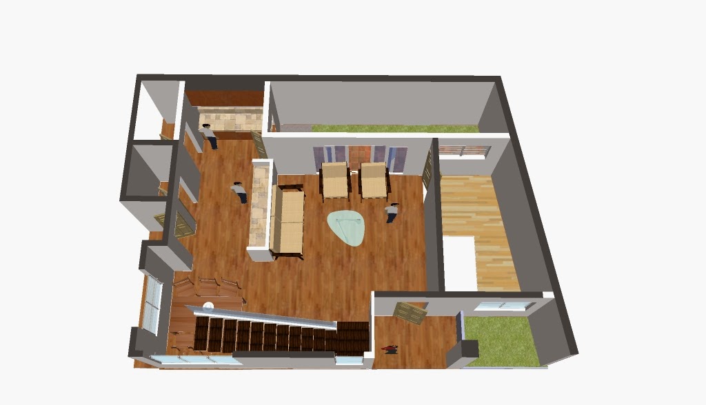
**SCHEME 1**


ground floor

second floor
**SCHEME 2**

ground floor


Hope you enjoyed this post.
**SCHEME 1**
ground floor
second floor
**SCHEME 2**
ground floor
2nd floor
*****************
Later, guys!
:)
For design inquiries, consultations, projects, collaborations, and whatnot,
please feel free to email atelierdeaurora@gmail.com
Click here for list of services.
**This project is in collaboration with Think Factory DS**
good info
ReplyDelete